i2Chain
i2Chain was facing challenges with fragmented user experiences across its website and mobile app due to inconsistent design elements and a lack of cohesive user flow. I led the redesign effort, focusing on creating a unified and secure platform that improved user onboarding, enhanced the visual identity, and streamlined document management processes. This comprehensive design overhaul contributed to increased user engagement and played a crucial role in securing funding and attracting prominent clients.
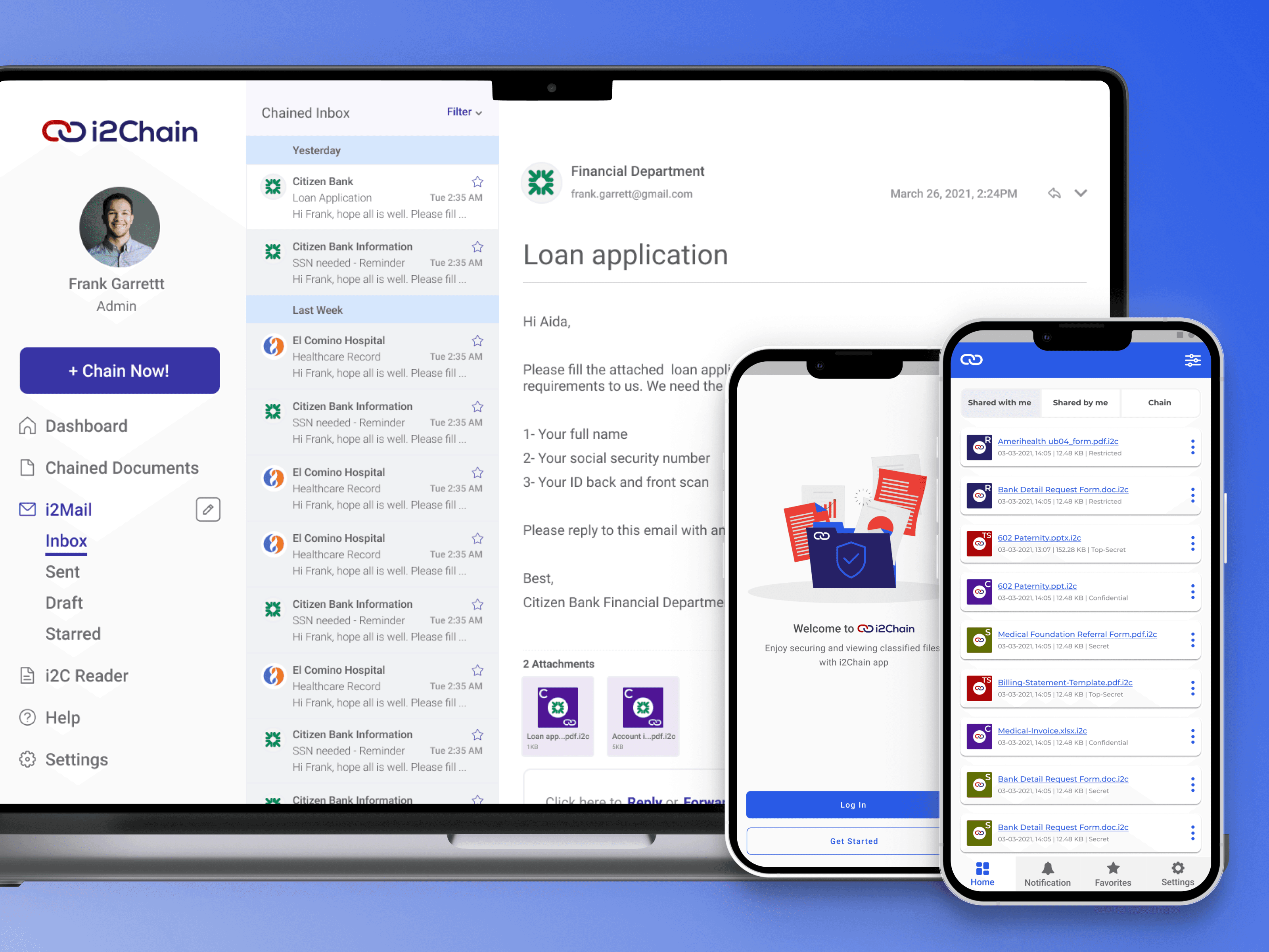
Redefining document security
In today's data-driven landscape, protecting sensitive documents is critical due to the rising threats of data breaches and stringent privacy regulations like GDPR. i2Chain offers a solution that secures and tracks documents throughout their lifecycle, ensuring data integrity and confidentiality. However, the initial design of i2Chain's application and products suffered from poor user experience due to a lack of research and usability testing. This led to functionality issues, user mistrust, and higher drop-offs. A comprehensive redesign was needed to address these challenges and enhance user interaction across various platforms.
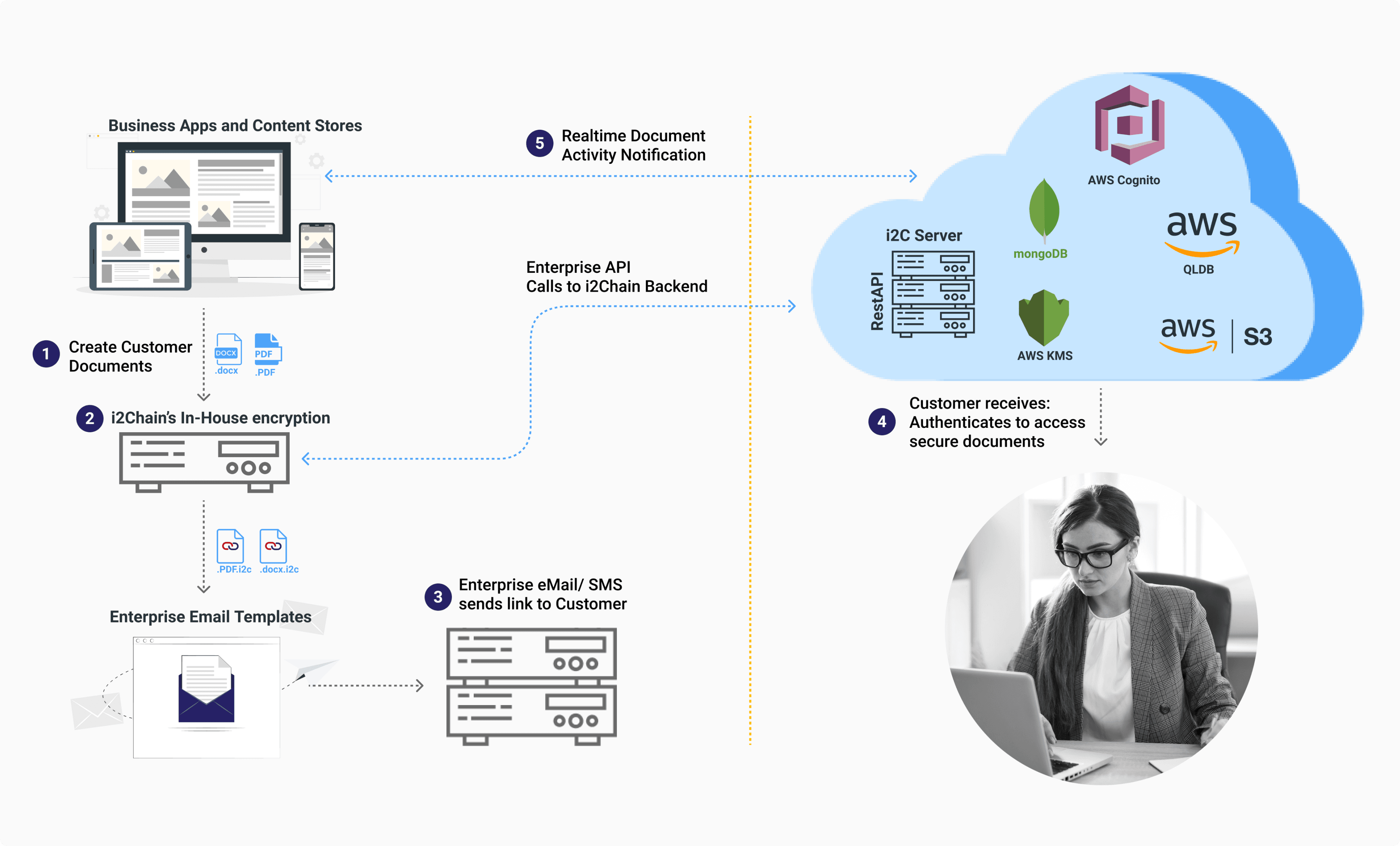
Users & Audience
i2Chain's users include businesses (B2B), such as corporations, financial institutions, and healthcare organizations, as well as individual users (B2C) like freelancers and small businesses, who need secure and traceable document sharing. Additionally, government agencies and tech teams managing security and compliance are key users.
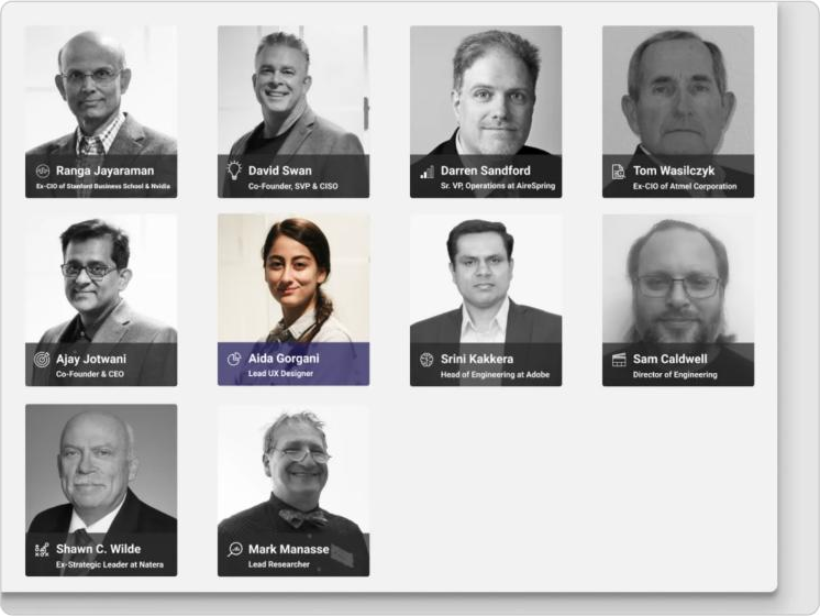
My Role
As a Lead Product Designer at i2Chain, I managed roles including Product Designer, QA Analyst, Developer, Technical Writer, and Marketing Strategist. I collaborated with Product Managers, Developers, and C-suite executives to ensure cohesive design and execution. My work involved partnering with clients like Citizen Bank to deliver secure solutions, shaping user experience and visual design, and contributing to documentation, quality assurance, and marketing strategies to enhance user engagement and product success.
Extensions
At i2Chain, I had the exciting opportunity to enhance the user experience of their groundbreaking platform that enables users to securely share documents through their everyday tools such as Outlook, Gmail, and SharePoint. As the product designer, I spearheaded the improvement of the usability, functionality, and aesthetics of the Outlook extension. Additionally, I played an integral role in the development process of the Gmail extension from the ground up. Through multiple design iterations and collaboration with the development team, we were able to create a seamless and secure document-sharing experience for users.
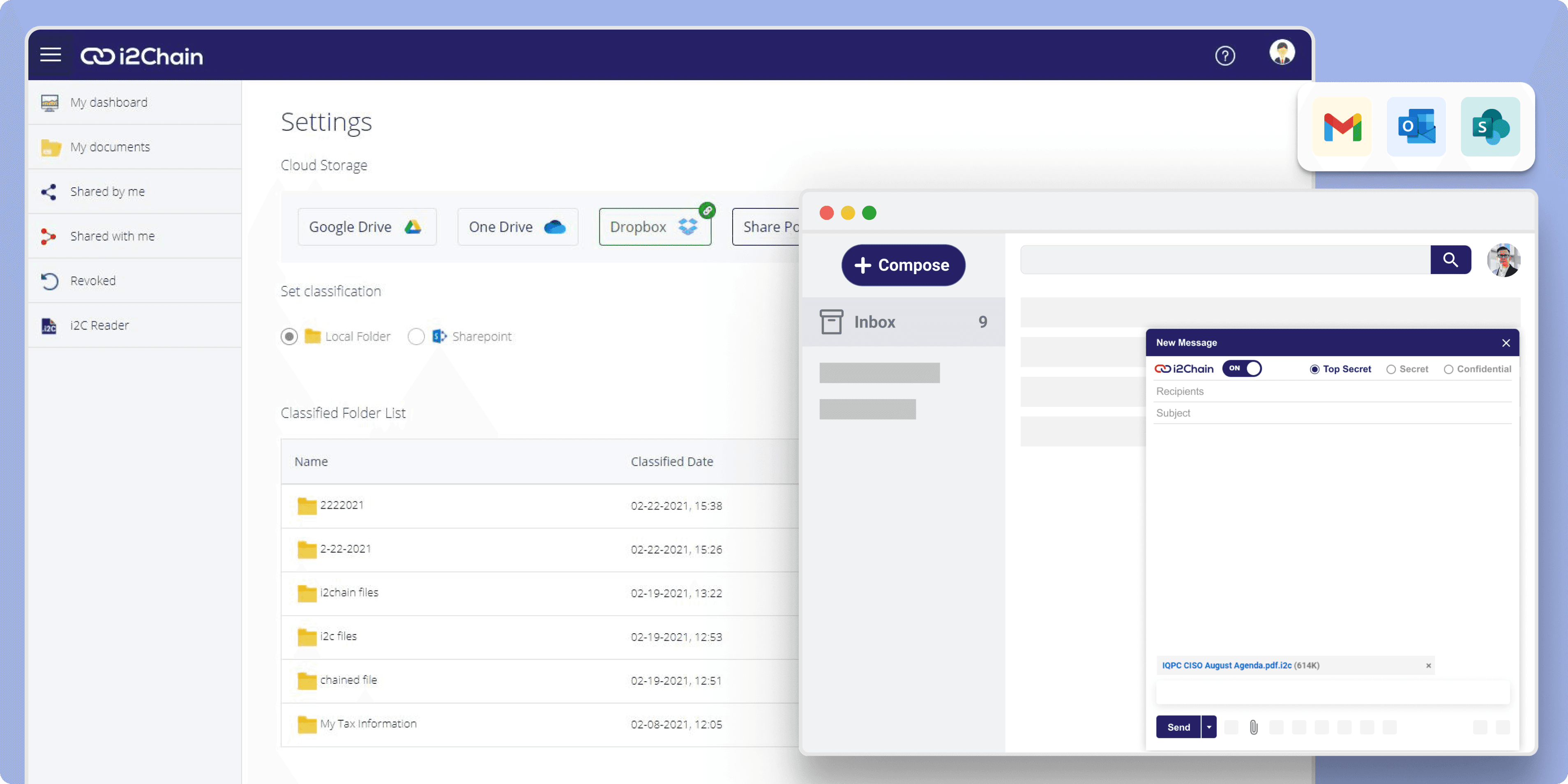 i2Chain Extensions
I have enhanced the usability, functionality, and visual appeal of the i2Chain Outlook add-in, which enables secure document sharing using familiar tools like Outlook and Gmail. Through client feedback and trend analysis, I have successfully redesigned and improved the add-in. It is now being utilized by users, and I invite you to watch the demo and experience this free and fascinating extension for secure document sharing.
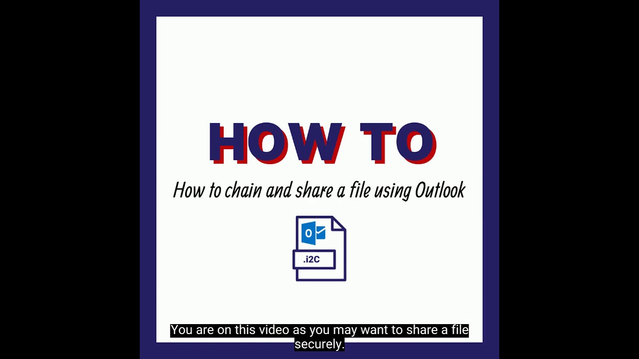 How to chain and share a file using Outlook
I was fortunate to serve as the designer for the i2Chain Gmail extension right from its inception. The design process began with brainstorming and sketching, followed by creating the user flow, and wireframes, and ultimately developing a high-fidelity mockup. To ensure the extension's usability, I conducted prototype testing with clients. Finally, I collaborated with developers to bring the design to life.
I encourage you to give it a try, as the i2Chain Gmail extension is now available on Google extensions and is already live.
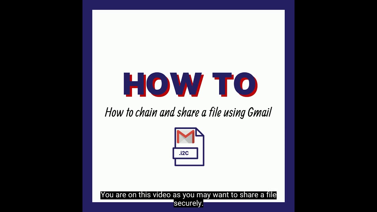 How to chain and share a file using Gmail
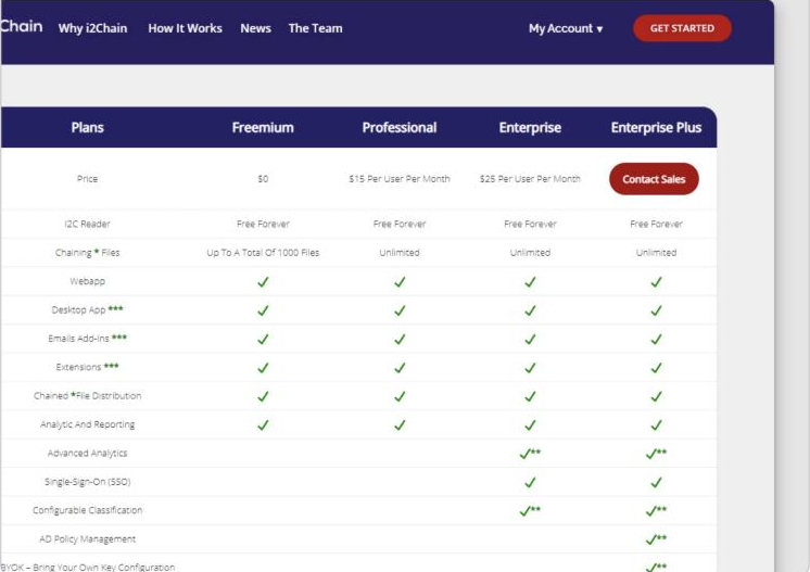
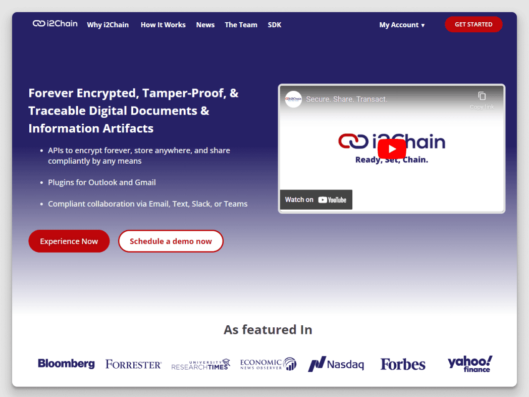
When I first started working on the i2Chain website, it was riddled with inconsistencies and irrelevant content, and filled with complex cybersecurity technical terms that made it difficult for the average user to understand. The user experience had been largely neglected, leaving much to be desired. As the sole product designer, I took charge of the redesign process, starting with a high-level strategy for the homepage, price plans, and main features, as well as step-by-step demos on how to use i2Chain's features. Due to limited resources on the developer side, I eventually had to develop my own design, which required several rounds of redesign and numerous tweaks to get it right. Despite the challenges, I was able to simplify the content and create an initial version of the design system to eliminate the chaos in colors and typefaces across the platform, starting with a unified color palette and typeface. Thanks to these efforts, user engagement increased significantly.
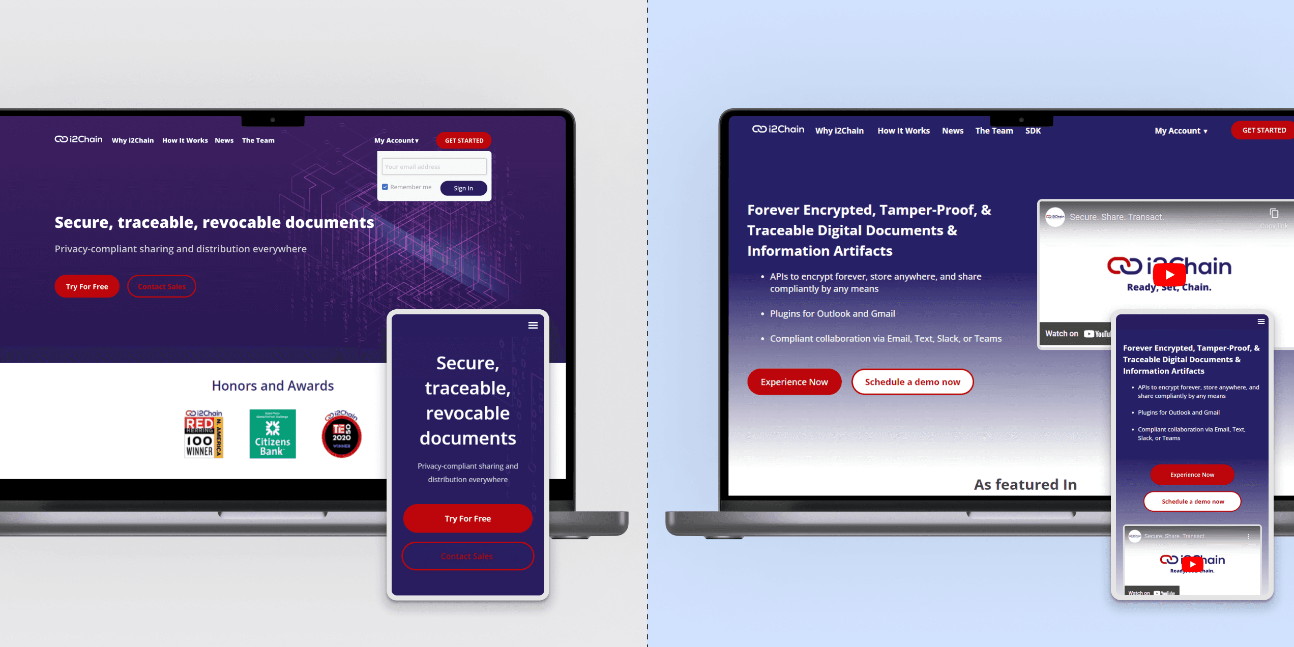 i2Chain website
As part of the improvement process for the i2Chain app, I focused on addressing inconsistencies, usability, and functionality issues. One area that needed significant attention was the notifications and emails that users received. Data analysis showed that users were quitting in the middle of the process due to confusing communication. To address this issue, I created a consistent visual design for all notifications and emails, ensuring that they were clear, concise, and easy to understand. I also created a template for these communications to maintain consistency across the app. Thanks to these efforts, user engagement and satisfaction with the app increased significantly.
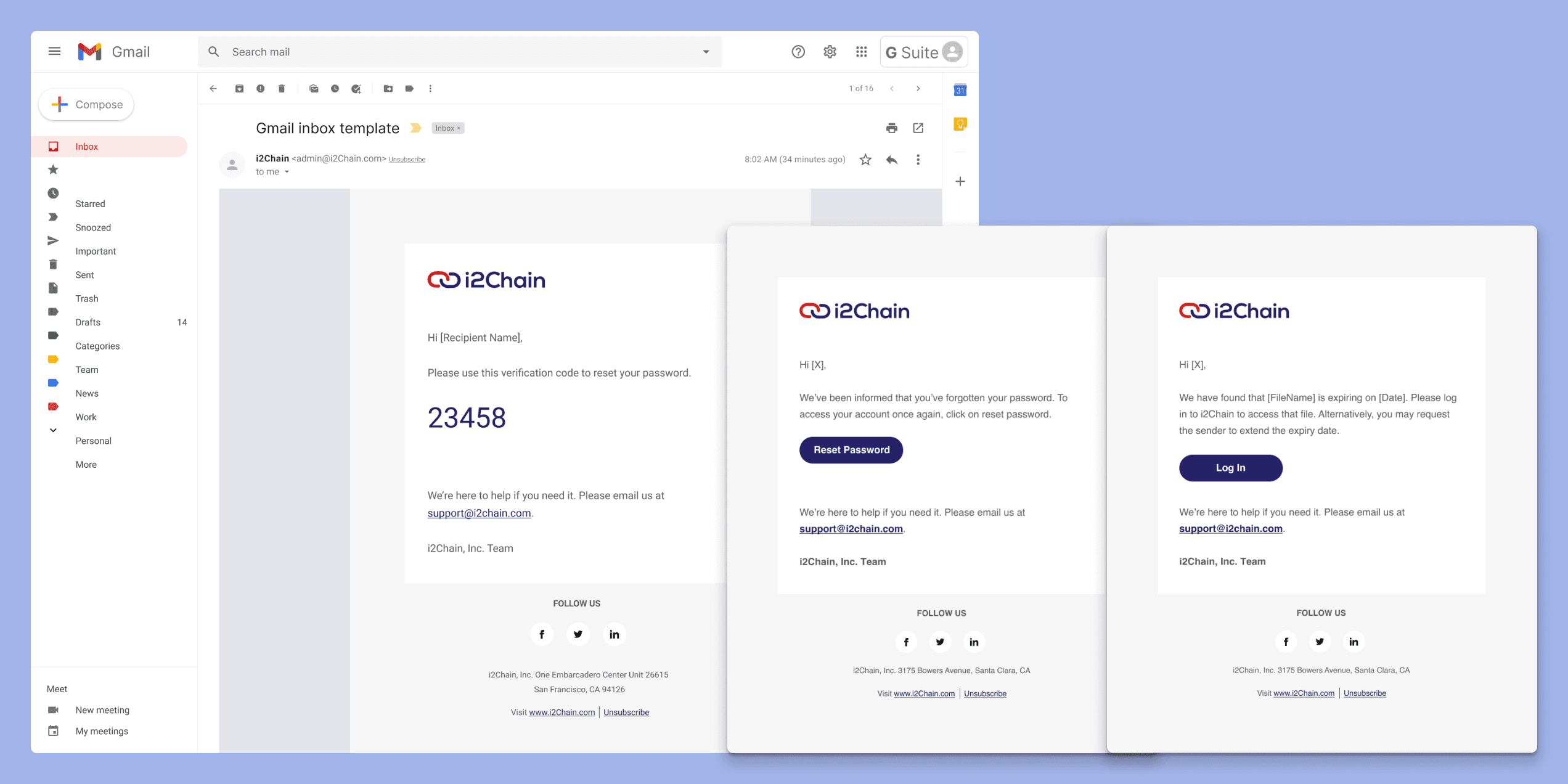 Notifications
When I joined i2Chain, the existing app had been developed with no user research or design principles in mind, and it lacked a responsive design. The app was based solely on assumptions made by the product manager, CEO, and developers, resulting in a complicated user journey and inconsistencies in components, interface, color palette, typefaces, and branding. As the sole product designer, I aimed to do a complete redesign from scratch, creating a responsive app with a cohesive visual language and a user-friendly interface. Thanks to this redesign, I was able to engage more potential customers, resulting in increased adoption of i2Chain.
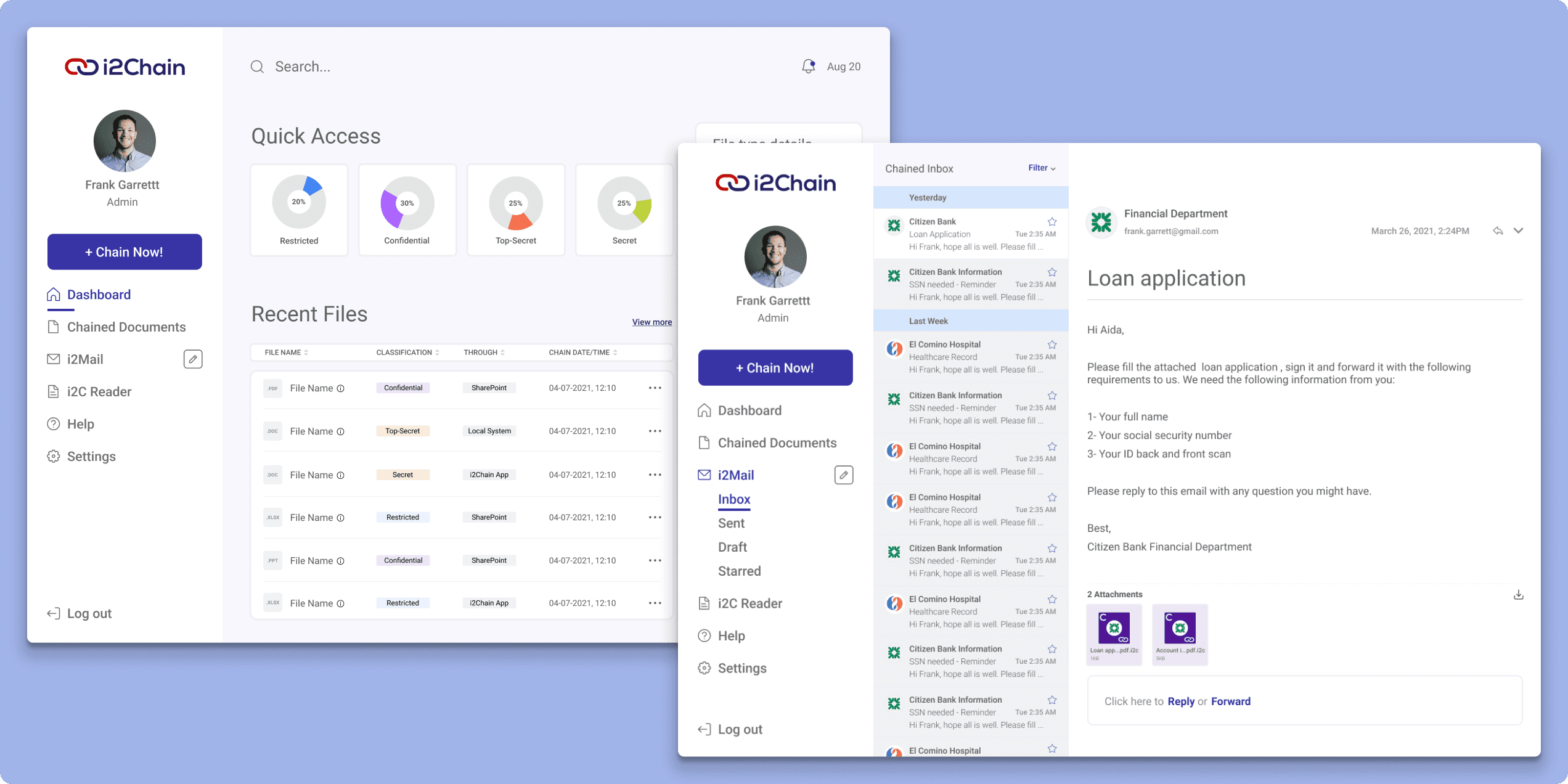 i2Chain web app
At i2Chain, I encountered a situation where there was no existing style guide or design system in place. Recognizing the importance of consistency and efficiency in design and development, I took it upon myself to create the initial style guide. This style guide served as a foundational resource and a source of truth for all team members, including developers and new team members who joined the company.
With the style guide as a reference, we were able to establish a unified visual language, define consistent typography, color palettes, and UI components. This helped streamline the design and development process, ensuring a cohesive and polished look across the i2Chain platform. By creating and implementing the style guide, I fostered collaboration and efficiency among the team members, enabling us to work more effectively and deliver high-quality designs.
Through my efforts, the user experience was significantly improved, and we saw a notable decrease in the number of users reaching out to support. The comprehensive admin user manual has become a go-to resource for users, allowing them to troubleshoot on their own and reducing their reliance on customer support.
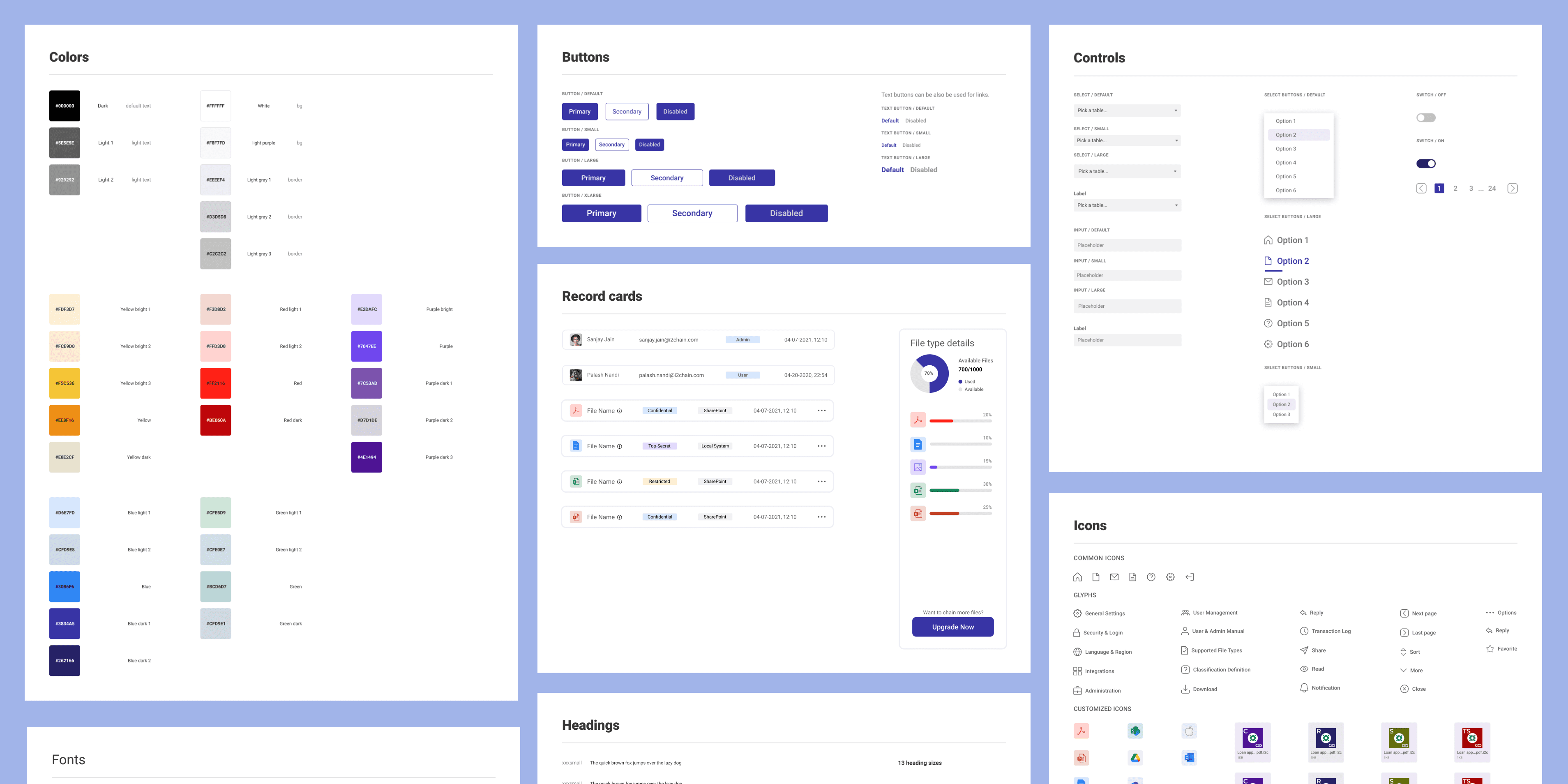 Design System and Branding identity guideline
As the technical writer at i2Chain, one of my most challenging tasks was developing a comprehensive user and admin manual for the i2Chain application. Given that the app had been developed without any design principles or user research, there was a lack of clear documentation for users to reference. To address this, I created a detailed documentation plan that included all the necessary information for a user manual, such as general information about the application, system requirements, available products, workflow details, and more.
Through my efforts, the user experience was significantly improved, and we saw a notable decrease in the number of users reaching out to support. The comprehensive admin user manual has become a go-to resource for users, allowing them to troubleshoot on their own and reducing their reliance on customer support.
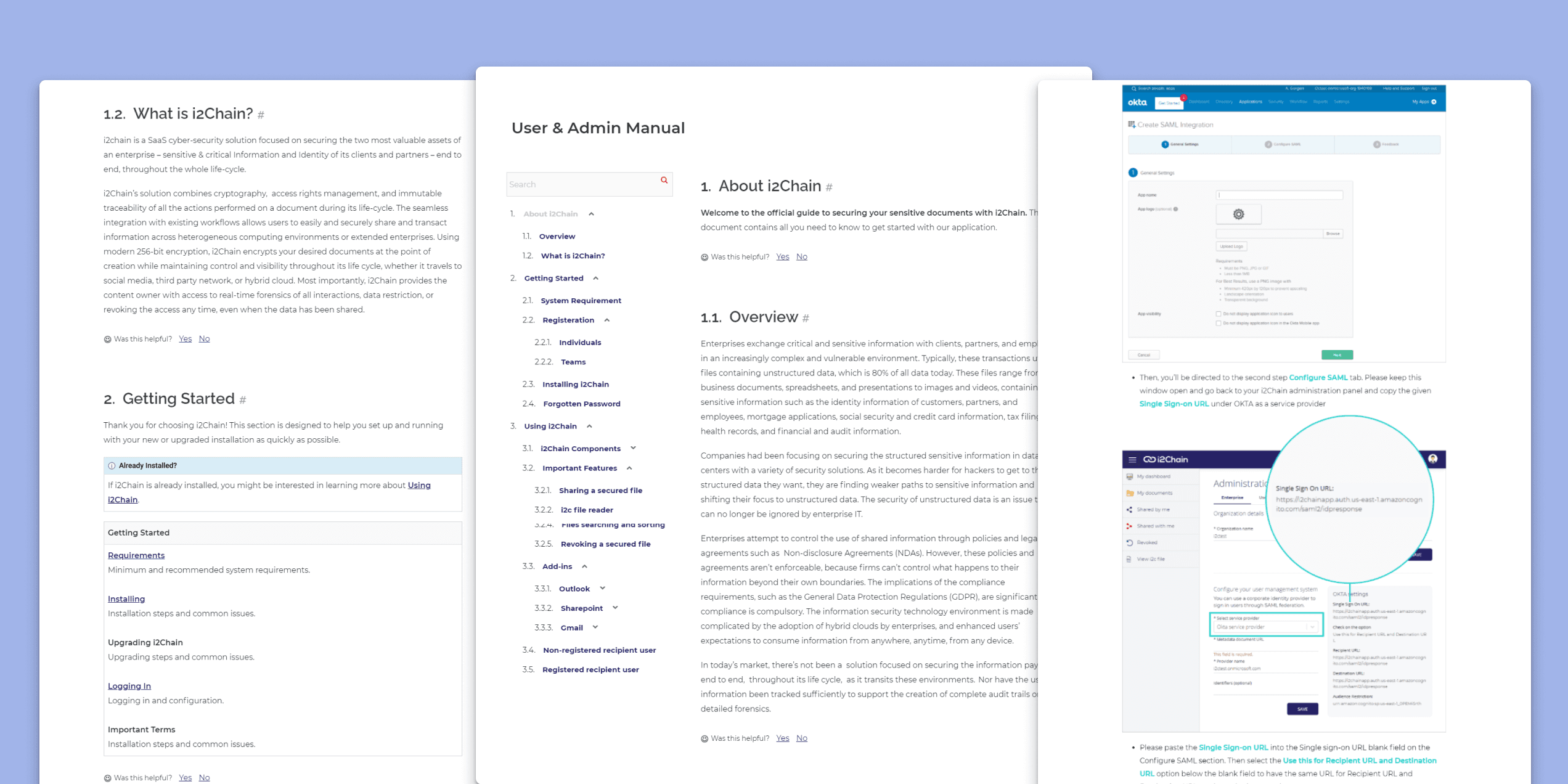 User & Admin Manual
I began by brainstorming and creating a wireframe and initial design for the Android app, drawing inspiration from the existing SaaS website. To improve the design, I actively sought feedback from peers and incorporated their suggestions. This iterative process allowed me to refine the Android app's design, ensuring it catered to the needs and preferences of our target users. The result was a polished and user-friendly final design that enhanced the overall user experience.
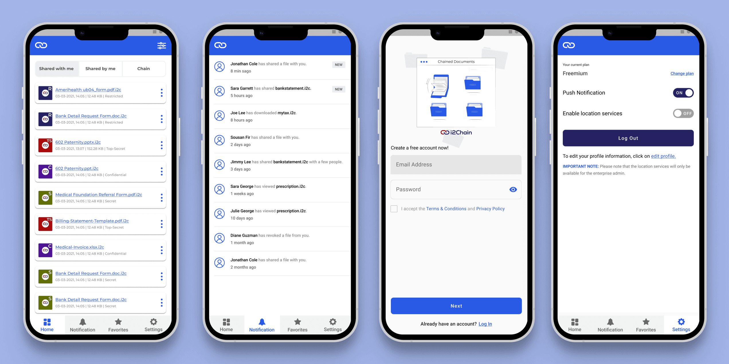 Android Mobile app
The impact
- Attracted major clients including Citizen Bank and Ameriprise Financial through strategic design decisions and improved user experiences.
- Established a style guide and design system for better collaboration and consistency.
- Increased client satisfaction and social media engagement through captivating demos and comprehensive documentation.
- Led design operations, collaborating with developers and project managers.
- Played a key role in securing $2.3M in funding through effective marketing and exceptional design work.
- Improved UX and visual design as an agile QA engineer.
- Contributed to the development of an award-winning product featured in Forbes, Bloomberg, NASDAQ, and more.
Want to dive deeper?
Happy to walk through the process and challenges behind this project — feel free to reach out.