Notification settings revamp
In 2021, U.S. Bank embarked on a mission to elevate its user engagement and consumer relationships by revamping its app and online banking alert management platform. The existing online banking alert management experience faced hurdles like outdated components and technology, poor user flow, and inconsistencies. I've been part of the alerts and notifications team since its inception, contributing to the business mission from the start.
Legacy design and outdated technology
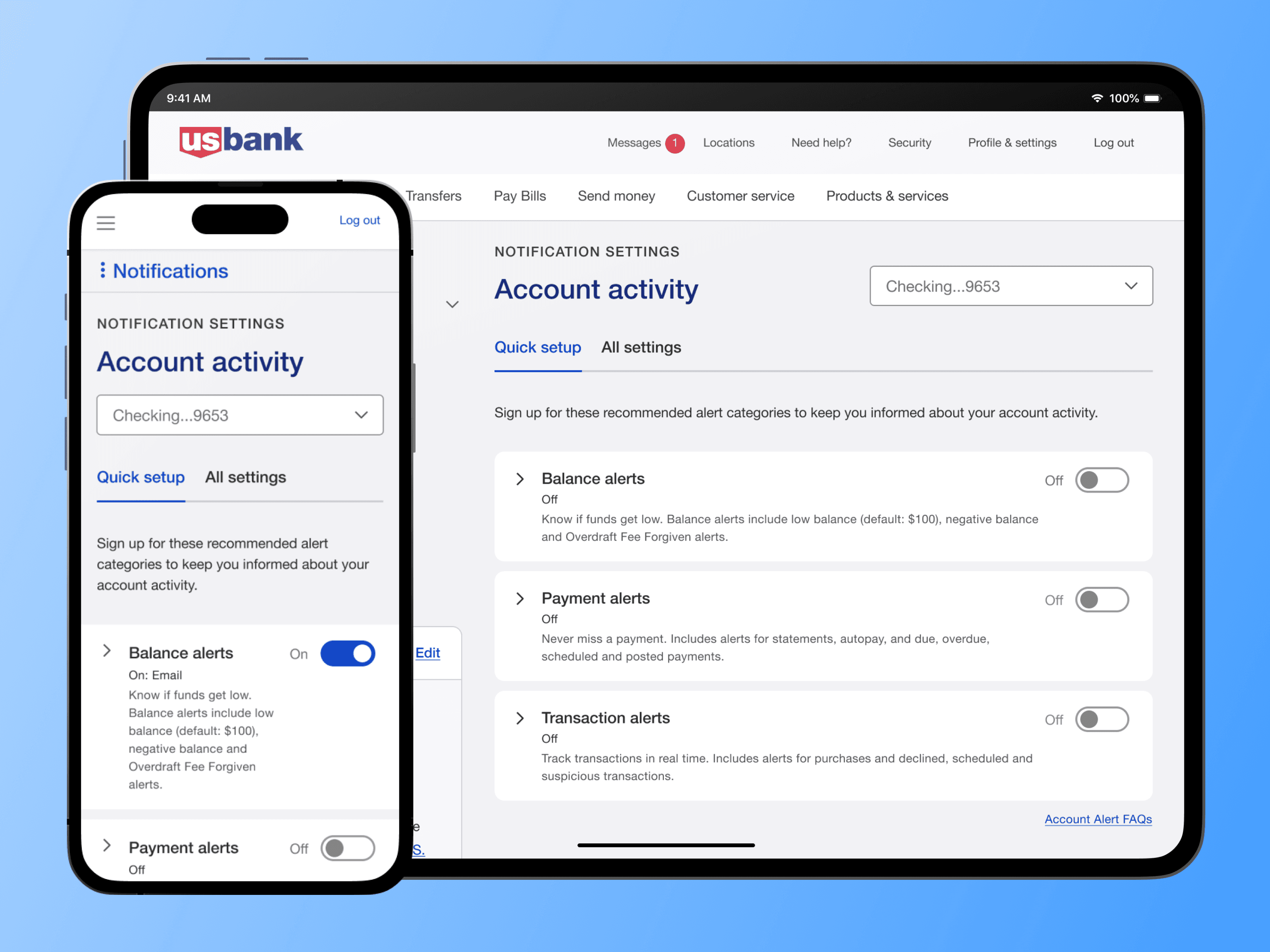
Alerts are vital for financial firms to communicate with customers, especially on security and account topics. U.S. Bank faced challenges with an outdated alert management system, including inconsistent UI, unresponsiveness, and a complicated enrollment process — leading to the creation of the Alerts & Notifications team.
Inconsistency and confusion
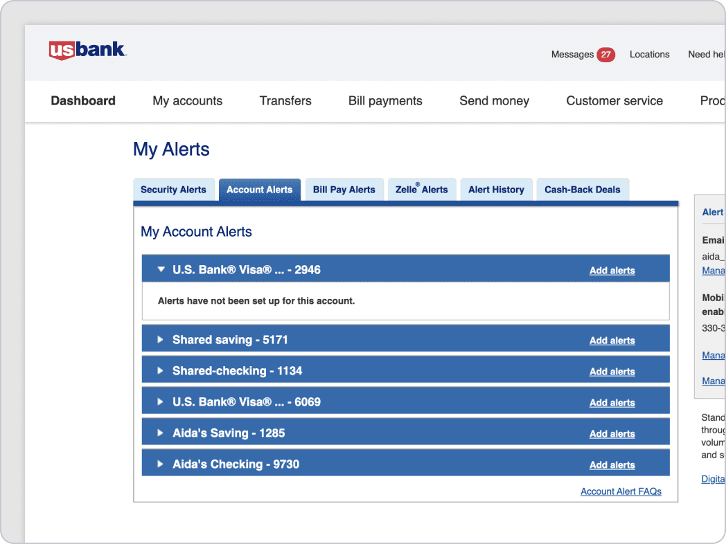
The alert management feature in online banking provided a unique experience due to its outdated design, featuring entirely distinct components, patterns, interactions, and even colors and typeface. Transitioning from a sleek and modern dashboard to this contrasting world of alert management brought about considerable confusion for users.
Competitive setback
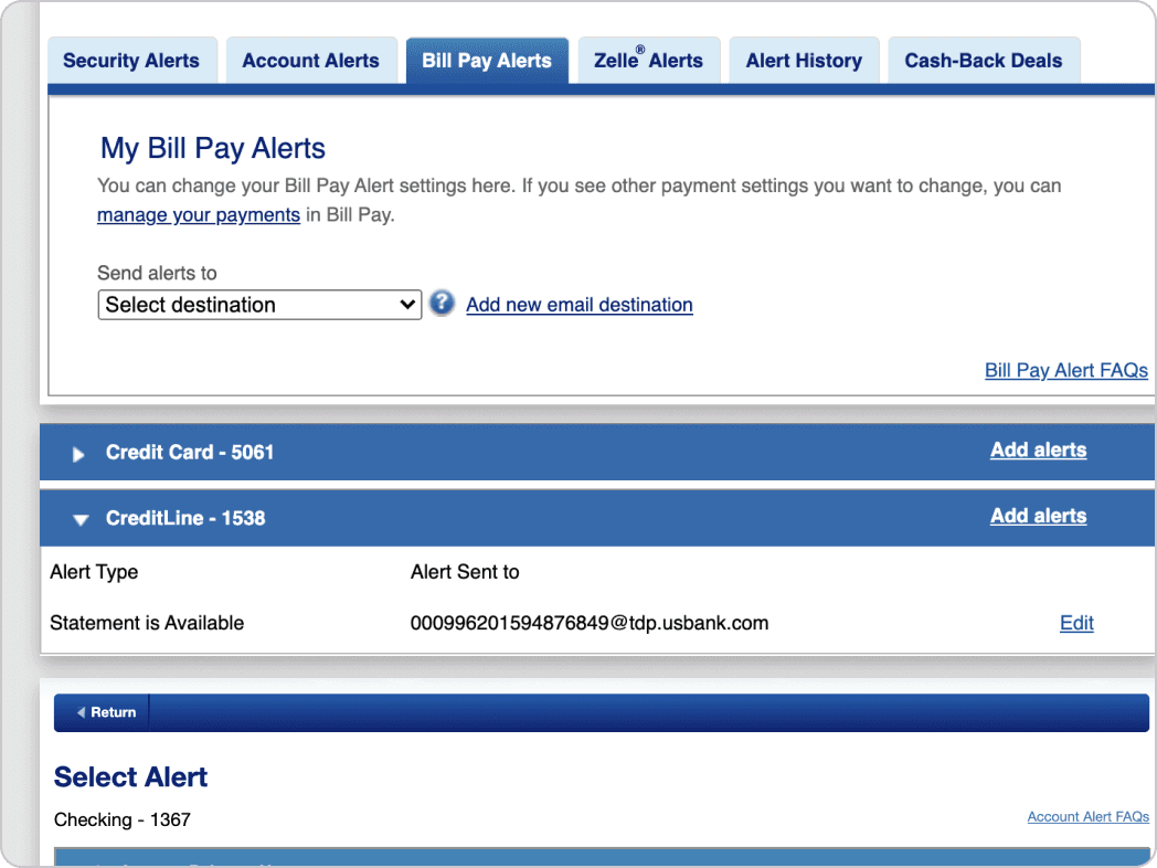
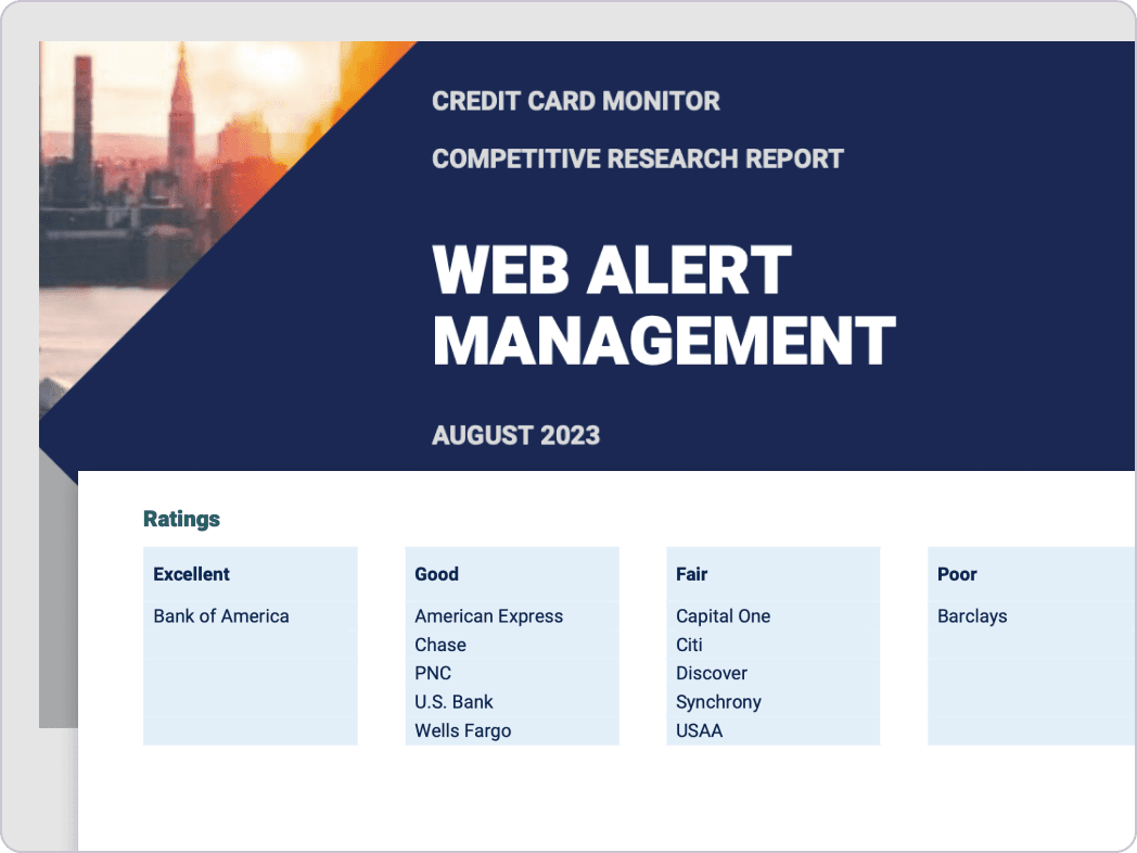
Corporate Insight, a leader in customer experience research, released a report in September 2021 reviewing alert management on eleven financial firms' desktop sites. The report evaluated the customer experience, and U.S. Bank's web alert management system was rated as "Fair" based on their best practices.
U.S. Bank web alert management offers one or two of the delivery methods (Email, SMS, Push) for many alerts but fails to offer useful alert features, employ a confusing enrollment journey or lack in design earn a fair rating in this report.
Optimized alert management menu at U.S. Bank
At U.S. Bank, we aimed to simplify the complex alert management menu, which featured multiple sub-menus across the web and mobile. To understand user mental models and identify pain points, we conducted a study using competitive analysis, open-card sorting, and closed-card sorting to create a streamlined, standardized menu for all digital platforms.
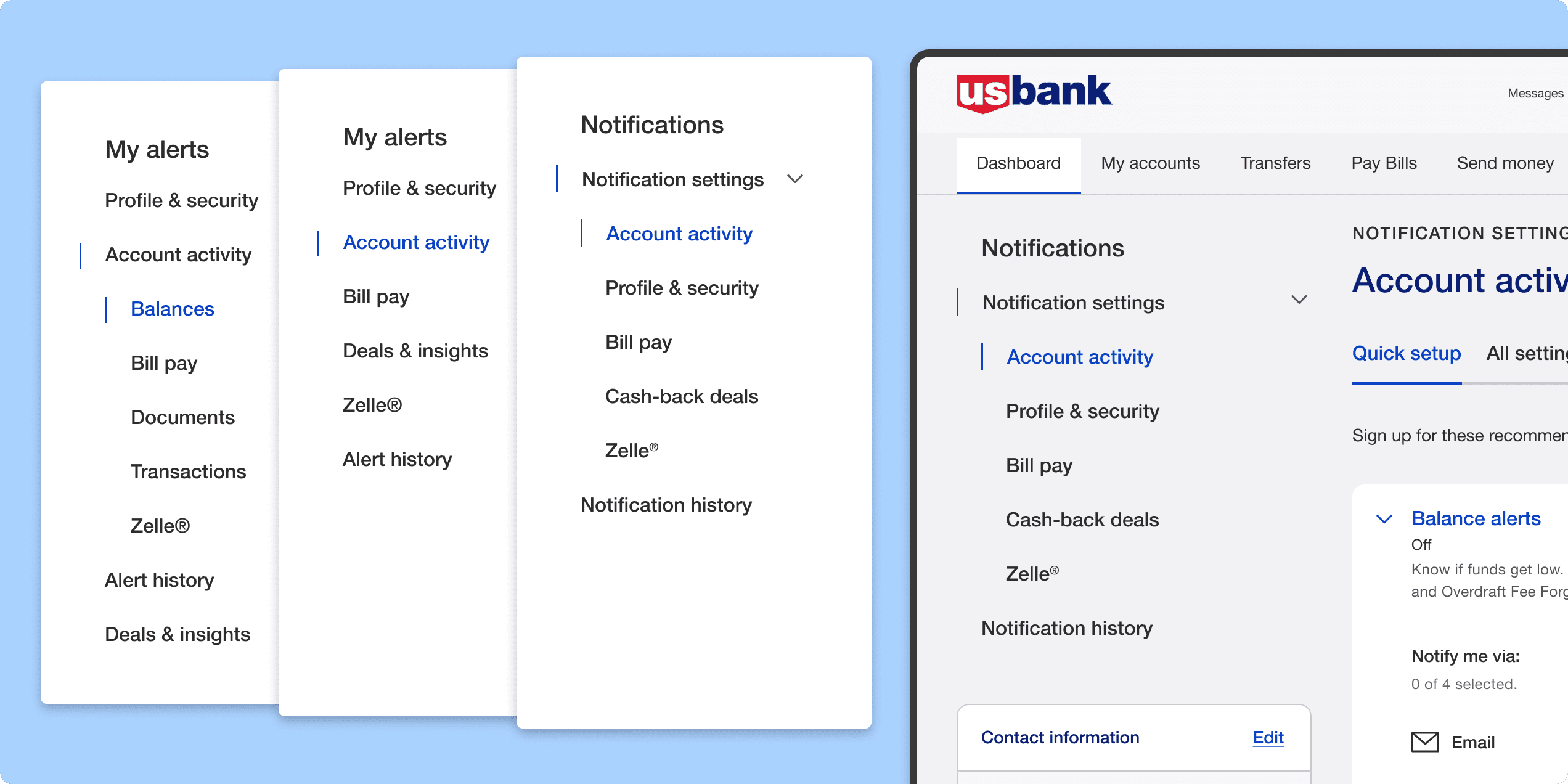 Left Navigation bar iteration over time
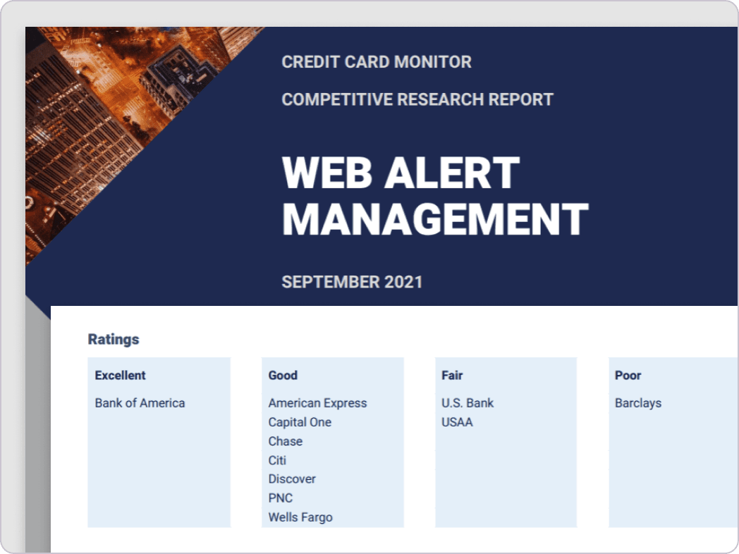
The "Account Activity" notification was particularly complex due to its many subcategories and diverse account types. Usability issues, highlighted in the 2021 Corporate Insight Report, included limited navigation, single-section expansion, and a step-by-step enrollment process that redirected users between pages. I redesigned the alert management system to a single-page experience, enabling users to manage, edit, and enroll in alerts without leaving the screen.
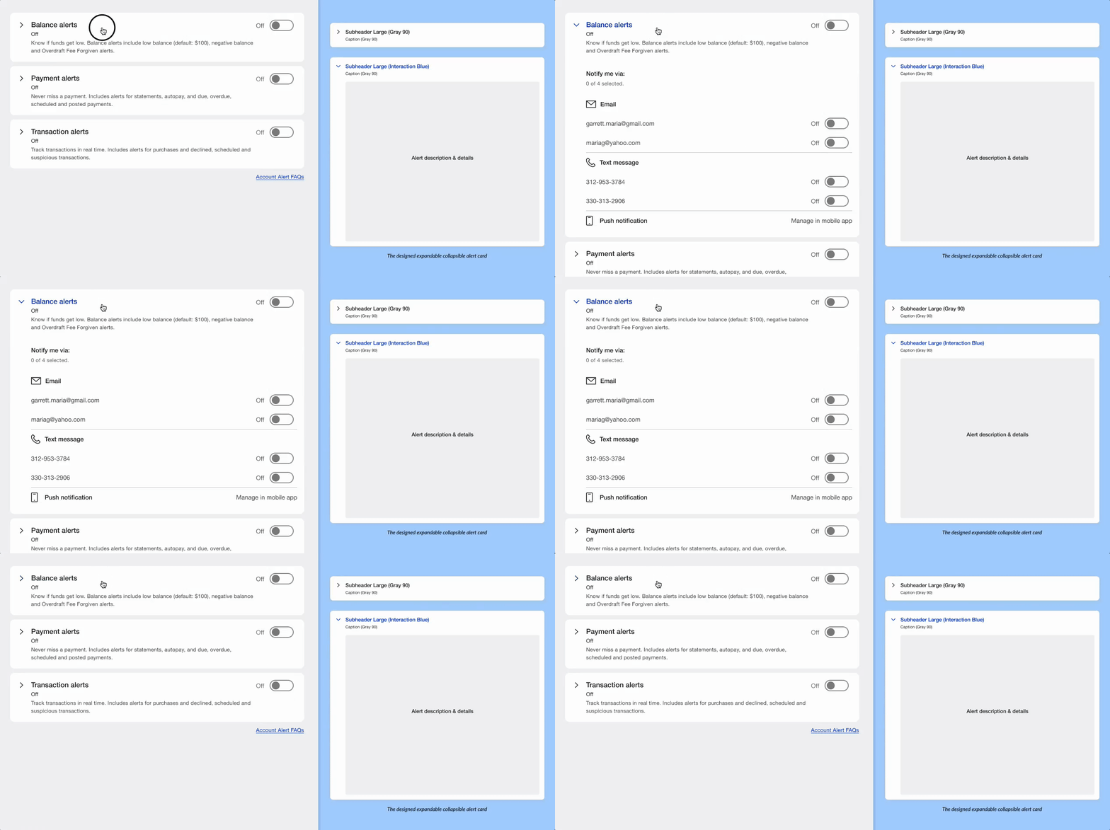 Single step alert enrollment
To increase alert enrollment and simplify management, we grouped alerts into bundles by importance. Inspired by the CNN mobile app, we conducted user research to create default categories for key alerts. Users could quickly set up important alerts with one click, while still having the option to customize them. The account activity screen was split into two tabs: "Quick Setup" for curated alert bundles and "All Settings" for more detailed customization.
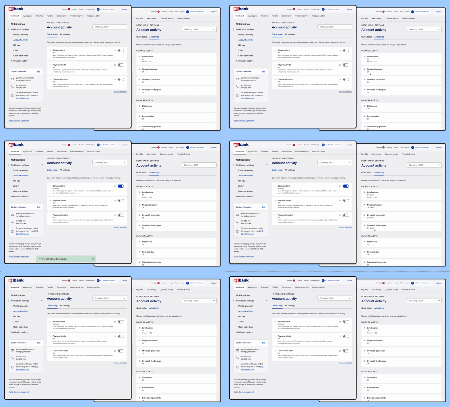 Alert bundle enrollment
Due to time and resource limitations, we prioritized popular account types like savings/checking and credit cards. While some users were prioritized, we aimed to serve the majority effectively. We then created a comprehensive alert inventory covering various account types and their associate alerts, including Investments, Trust & Investment, Line of Credit, and Corporate Cards.
Redesigning the account activity proved to be the toughest challenge. With various subcategories differing across account types, we needed a comprehensive inventory for alert management that captured all account types and alert categories.
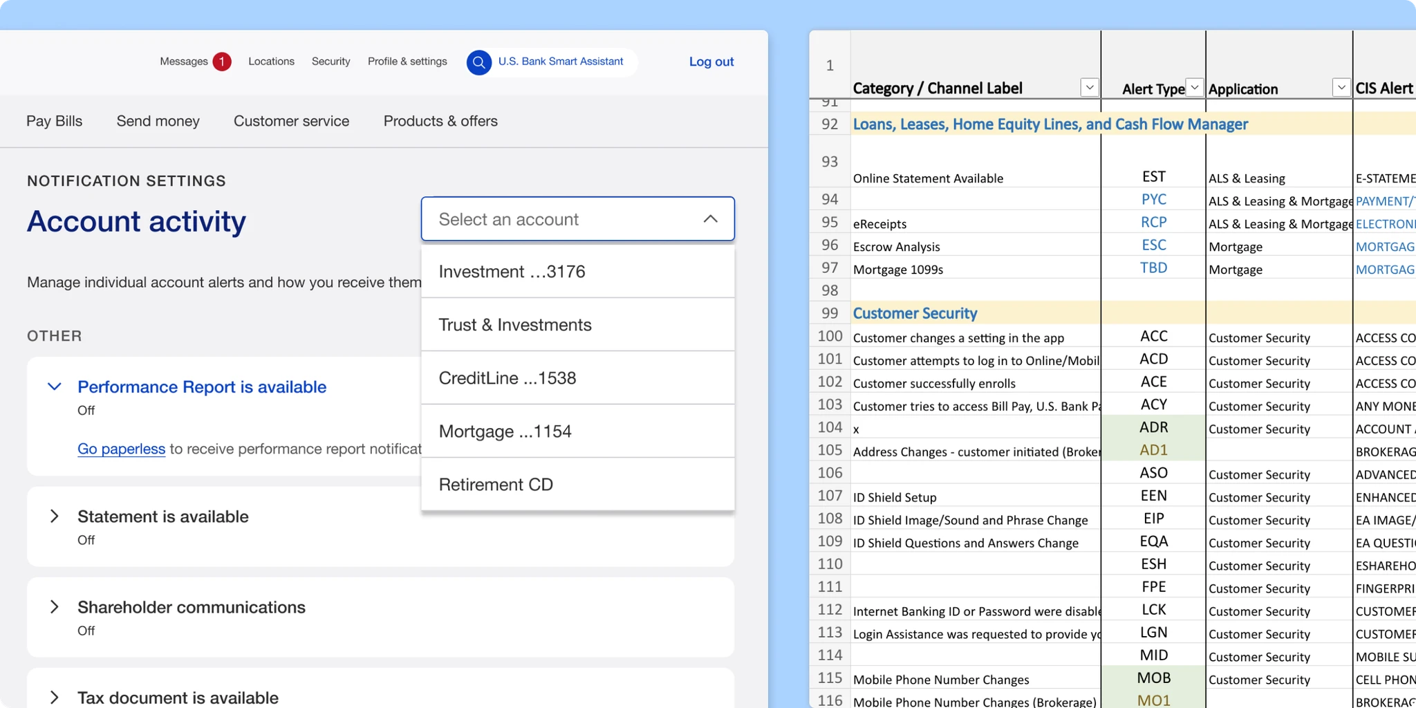 Comprehensive alert inventory across account types
Integrating modern design trends into traditional banking was a challenge, particularly when deciding between conventional checkboxes and toggle buttons. After discussions with the team and stakeholders, the toggle button emerged as the better option due to its alignment with our mobile app, elimination of extra clicks, and streamlined user interaction.
Advocating for this change faced resistance due to concerns over web usability and accessibility, but after design reviews and testing, we moved forward.
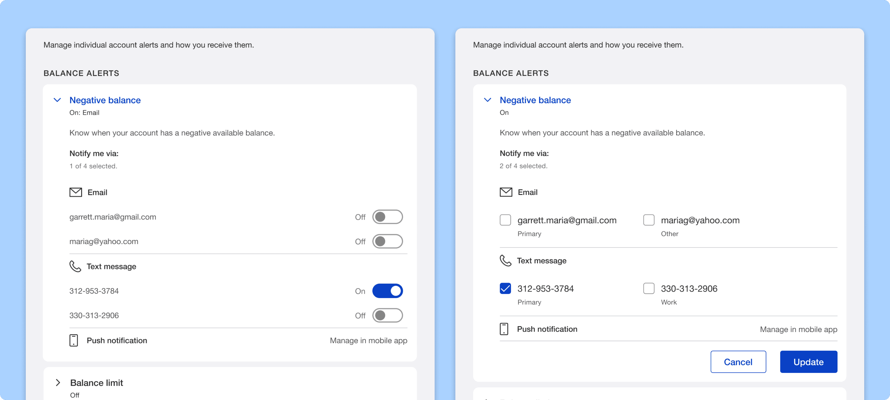 Toggle button vs Checkboxes
User research key findings
Unmoderated usability tests with 20 users showed:
Ultimately, the toggle button enhanced efficiency and improved the overall user experience.
U.S. Bank partners with various card providers, and our designed alert management served as a foundational resource for them, prompting redesigns on their platforms as well. Our team spearheaded this collaboration, ensuring partners could launch their updated alert management designs seamlessly. The outcome was a cohesive alert management experience across all platforms and their associated products.
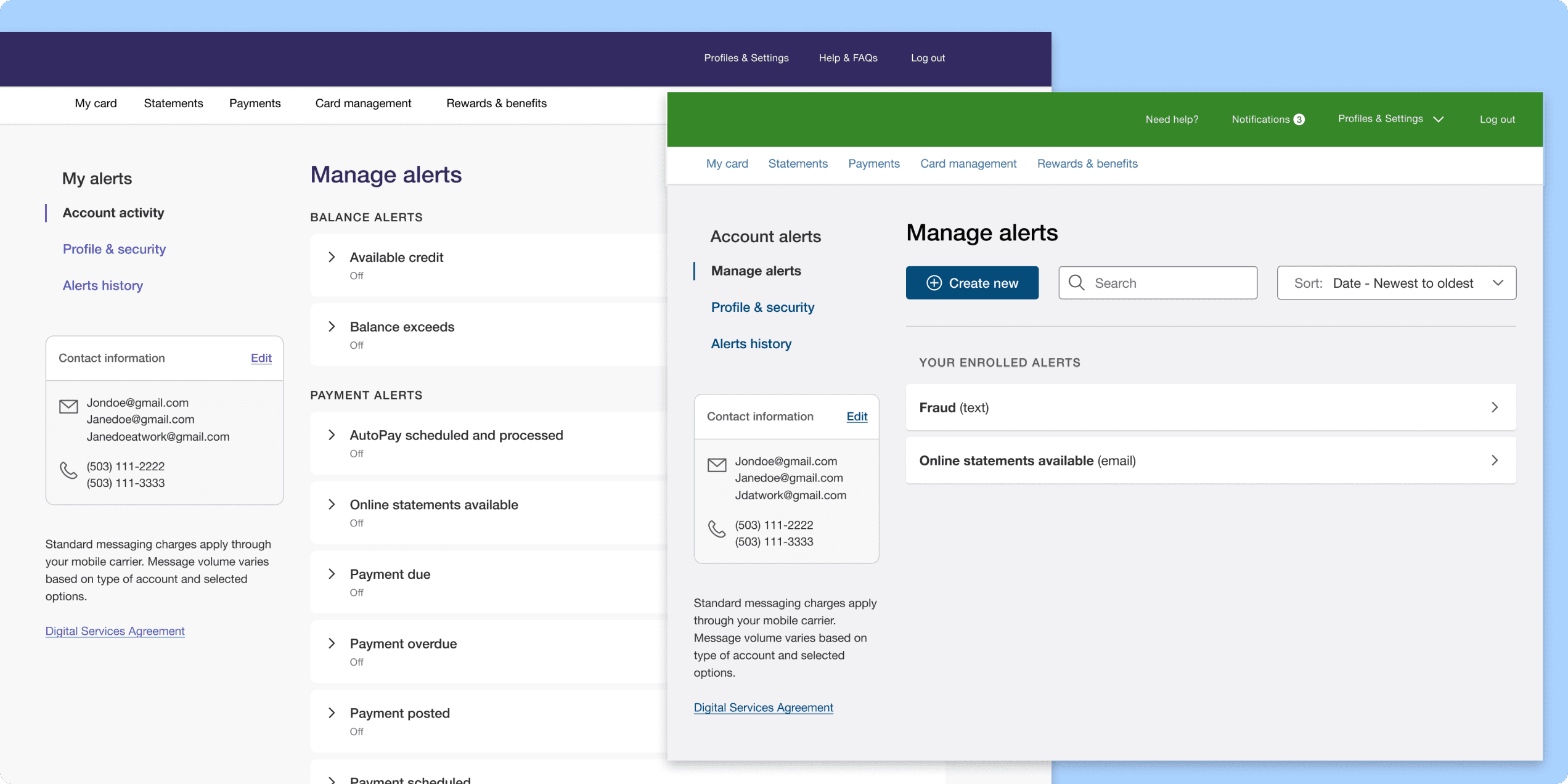 Partner card designs
In addition to redesigning and enhancing the existing alert management system, I introduced new user experience improvements, including optimizing error scenarios and implementing skeleton loaders to account for API wait times. These adjustments ensured a smoother and more responsive experience for users. Moreover, we focused on accessibility, ensuring that the design was inclusive and adhered to A11Y standards. By expanding the platform to partner card systems while maintaining consistency and accessibility, we were able to scale the solution effectively across multiple platforms.
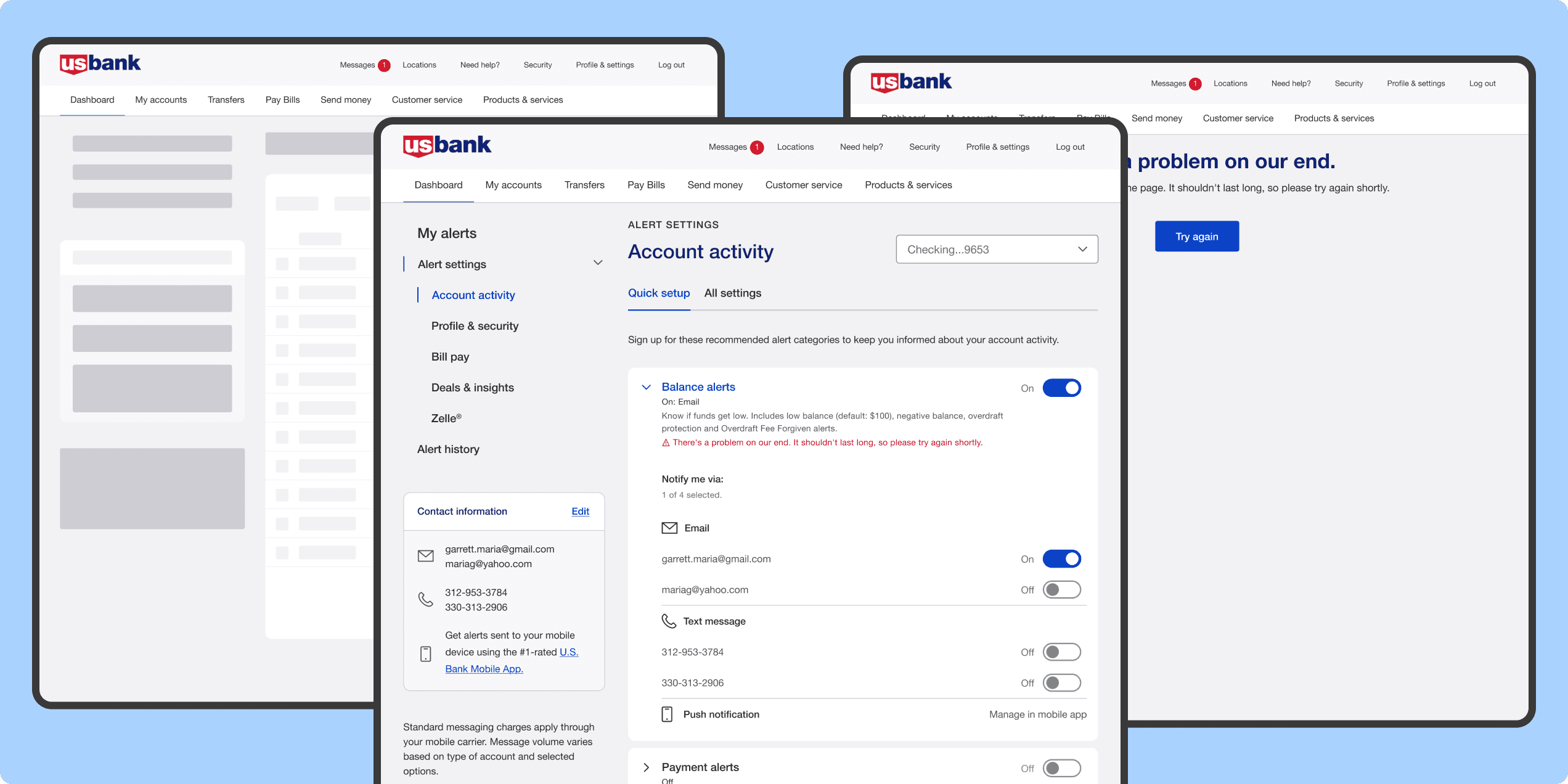 Enhancing overall user experience
We pioneered the introduction of the toggle button on our web platform, integrating it with collapsible-expandable cards for consistent alert management. As teams across the bank adopted our solution, I created a centralized component library for alerts and notifications, ensuring design consistency. To bridge the gap between design and development, I crafted a comprehensive Figma flow and curated a design library with components, patterns, and accessibility guidelines for all teams.
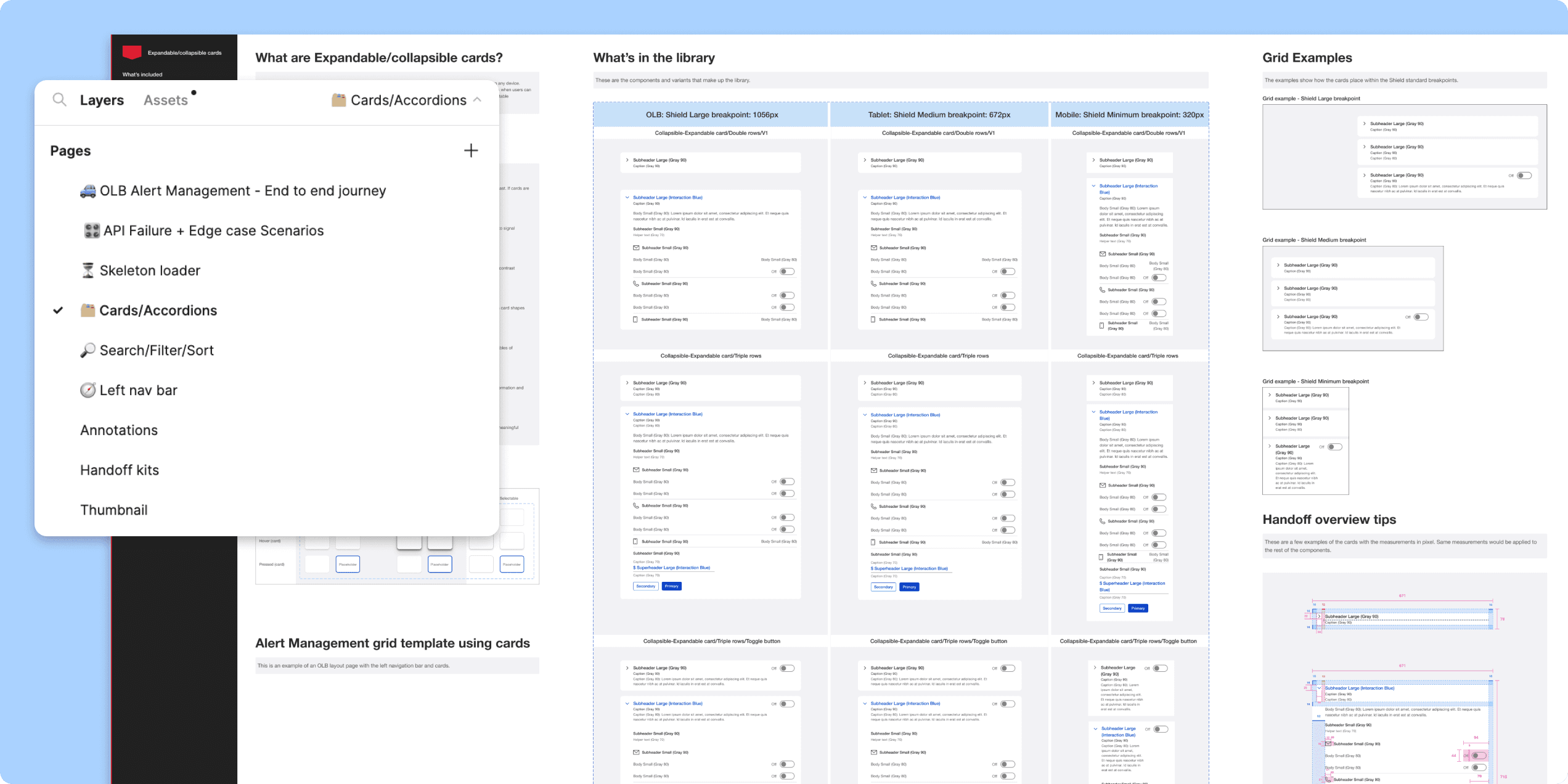 Enterprise community library
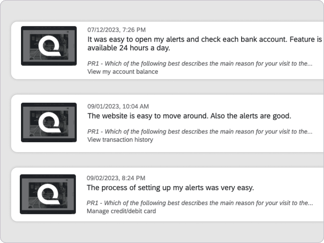
The positive user feedback
Received numerous positive feedback from qualitative survey on online banking alert management as soon as the initial MVP launched. It was a great success for our team to see the users are able to easily achieve their goals through the redesigned platform.
The Corporate Insight rating changed from Fair rating to Good
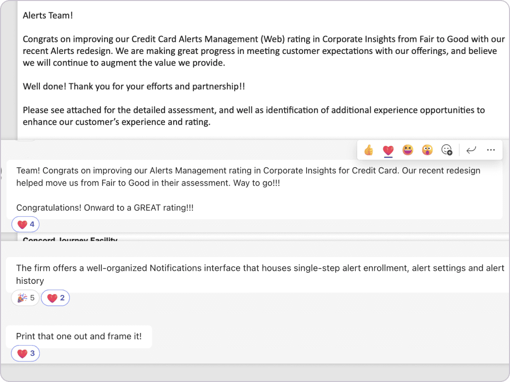
With the new alert management released, we earned recognition from the prominent Corporate Insights Report on improving the Credit card alert management (Online Banking) rating from Fair to Good with our recent Alerts redesign and enhancements. 🥳🍾🎇
Exceeding business objective
One of the business goals in 2023 was to increase the interactions from alerts/notifications into digital by 10% which our team was able to surpass the business goal by increasing the interaction by 14X%. One of the main reason of this interaction increase was the alert management redesign and the way they could easily manage the alerts and get back to the digital platform.
Want to talk through this one?
Happy to walk through the research, the alternatives I ruled out, or how it shipped.